What is a Hero Section Web Design?
When you check a website, the biggest striking section is usually the large area that is placed at the top of the page. This is referred to as the hero section. The hero section is a very significant component in the web design that aids in establishing the atmosphere, getting the visitors interested and conveying the central information of the web site. However, what is a hero section and what is the big deal? Let’s break it down.
What Does “Hero Section” Mean?
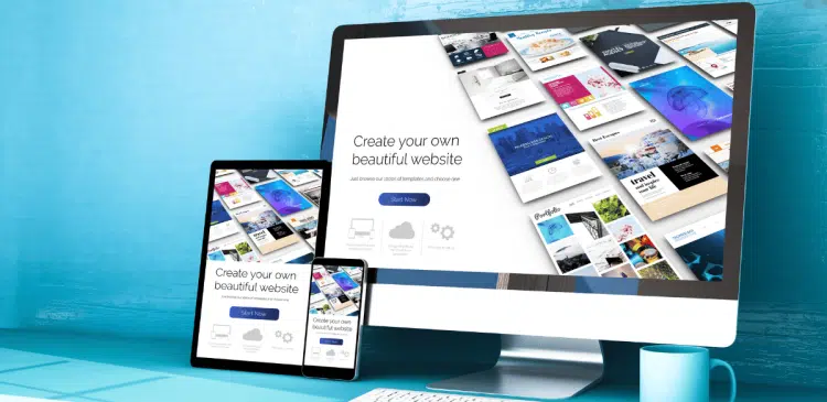
The hero section is the massive banner or space on the upper section of the webpage or landing page. It is commonly the first item that a visitor looks at, and it has to attract attention right at once.
In hero section, one may find:
- A headline or main message
- A sub title or follow up text
- A call to action (CTA) button
- A background, video, or eye-catching image.
You can imagine it as the “hero” of the webpage- the main figure of the story and the person that can direct the visitors in what you would want them to do next.
Why Is the Hero Section Important?
First Impressions Matter
Visitors on average make decisions on whether to remain in a site or not in a matter of seconds. The first impression is formed by the hero section, and this is an enormous contribution to that choice. A prepared hero section is a quick and easy way to tell what the site is, and why the visitors should be interested.
Drives User Engagement
These compelling calls to action and clear headlines on the hero section will drive visitors in taking a certain action, such as registering, buying, or reading more information. It is a chance to guide the users and increase the rates of conversion.
Builds Brand Identity
It is also in the hero section that you can demonstrate the personality of your brand in terms of visuals and messages. It assists in building the emotional bond with visitors, and makes your site to be remembered.
Key Elements of a Hero Section
In order to have a better idea of what the component of a hero section is efficient; we should consider its major aspects.
Headline: The Main Message
The hero section star is your headline, it should be:
Clear and concise: It has to be simple and clear: visitors need to know what you are offering within a few words.
Benefit-driven: Emphasize the way your product or service is solving a problem or is valuable.
Attention-grabbing: Strong words or questions may be used to stimulate curiosity.
Supporting Text (Subheadline)
The subheadline backs the first headline with more information or accentuating the advantages. One should be able to read it with ease and create clarity without overloading the visitor.
Example:
Change the lives of thousands of users and transform their health with our professionally-crafted plans.
Call to Action (CTA)
A button or a link that urges the visitors to proceed is called the CTA.
It might say things like:
- “Sign Up Now”
- “Get Started”
- “Shop the Collection”
- “Learn More”.
Ensure that your CTA is attractive to the eye, easy to be clicked and that it communicates to the visitor clearly what they are getting on clicking.
Visuals: Images, Videos, or Backgrounds
The graphics in the section of the hero are effective media to attract attention and elicit emotion.
Options include:
- Good images of goods, faces, or even lifestyle.
- Videos which illustrate a product or narrate a story.
- Graphic or illustrations that are in line with your brand.
- Text contrasting and mood-making background images or colors.
- Your message should not be lost in good visuals, rather it should be supported.
Types of Hero Sections
There are not identical hero sections. You may have different types depending on the purpose of your website.
Image-Based Hero
It is the most widespread one, where you have a powerful image behind or beside your headline and CTA. Best with lifestyle brands, online stores, and portfolios.
Video Hero
With a video background or embedded video on the hero section, it is possible to introduce energy and interest. It is used among creative agencies, product demonstrations, and travel websites.
Minimalist Hero
Other sites use a clean hero section with little writing and no photos. It is a good luxury brand, consulting firm, or any other site with the desire to appear sophisticated and without distractions.
Interactive Hero
Sophisticated hero sections can have animations, sliders, or other interactives that attract users. This is a more sophisticated type that has the potential to make the experiences memorable.
Best Practices for Designing a Hero Section
With the understanding of what a hero section is and what it entails, the following are some of the best practices associated with building a successful hero section.
Keep It Simple and Focused
Do not put excessive information and visuals on the hero section. The idea is to convey one key message in a concise and fast manner.
Use Readable Fonts and Contrast
Ensure that your text is clear in the background. Have readable fonts that are large and contrasting colors.
Optimize for Mobile
A large number of users browse on their phones. Your hero area must be nice and work well on a smaller screen. That is to say, readable texts, clickable buttons, and quick loading images.
Include a Clear Call to Action
The CTA must be clear and conspicuous. Use clear CTAs such as click here and not general ones such as click here.
Test and Iterate
Experiment with headlines, images, and the placement of CTA to identify the best ones to use with your audience. Optimize your hero section in the long run using A/B testing.
Common Mistakes to Avoid
Even straightforward hero parts can backfire when you do not watch.
The following are some of the pitfalls to be avoided:
Excessiveness in text: Visitors will not read text in the hero section. Keep it short and punchy.
Inconsistent communications: Do not use jargon or general expressions. Your headline must communicate immediately your worth.
Poor quality of images: Blurry pictures or irrelevant pictures may scare away people. Use professional visuals.
Hidden CTAs: Do not force the visitors to look where the next step is. Put your CTA in the middle of the page.
Disregarding speed: Large pictures or videos may slow down your site, which annoys the audience.
 Bill Yeager, Co-Owner of High Point SEO & Marketing in CT, is a leading SEO specialist, Amazon international best-selling author of the book Unleash Your Internal Drive, Facebook public figure, a marketing genius, and an authority in the digital space. He has been personally coached by Tony Robbins, a fire walker and a student of Dan Kennedy, Founder of Magnetic Marketing. Bill has been on several popular podcasts and the news including Sharkpreneur with Kevin Harrington, FOX, NBC, and ABC by way of his Secret Sauce marketing strategies. Bill enjoys fitness, cars, and spending time with his family when not at work.