How to Use Whitespace Effectively in Web Design

Whitespace is not an empty space in the context of web design. It is an effective design tool, which can enhance the readability, attention, and the user experience. Whitespace can be utilized to create a clean, professional and easy-to-navigate look of the websites. However, when used or disregarded improperly, it may result in messy and disorienting designs.
This guide will explain how and why whitespace is an important element of web design, and what best practices are to ensure a clean and user-friendly site.
What does Whitespace in Web Design mean?
Definition of Whitespace
The white space or negative space is the area that is not marked on a web page. It is the gap between the items, e.g. text blocks, images, buttons, menus, etc.
This space does not necessarily need to actually be white – it can be any color, background, texture or even an image is fine provided that it separates elements and allows them to breathe.
Types of Whitespace
Web Design Has Two Primary Whitespace:
- Micro Whitespace: Small gaps between objects such as letters, text lines or buttons.
- Macro Whitespace: Bigger spaces, e.g. margins, padding, inter-sectional or inter-component space.
Why Whitespace Matters
Improves Readability
There is no spacing between the lines or paragraphs on a page which is overwhelming. Whitespace enables the users to scan through the content with ease, enhancing readability particularly in the mobile devices.
Enhances Focus
Whitespace assists in focusing the attention of the users. It emphasizes such important parts of content as calls to action (CTAs), headings, or pictures by contrasting them with less significant information.
Boosts User Experience
Through a simple, clear design, cognitive load is minimized and the user is able to locate what they need much easier. This results in increased interaction and increased time on the site.
Supports Branding and Aesthetics
The whitespace may make a site look classy and upscale – it is common with luxury brands and contemporary designs. It conveys professionalism and deliberateness.
Where to Use Whitespace in Web Design
 Around Text Content
Spacing between paragraphs and lines between lines should be used extensively. When using body text, strive to have a line height that is 1.4-1.6 the font size. Provide space above and below paragraphs to provide the eyes some rest.
In Navigation Menus
The spacing between the elements in the navigation bar does not make the menu look crammed. A spacing between menu items enhances the clicking ability and eases navigation on the site, particularly on touch screens.
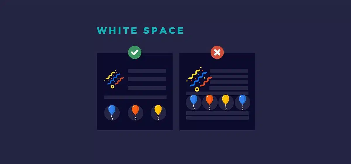
Around Images and Graphics
Images must be spaced out to make them not crowded. Spacing or padding of images can be used to emphasize images and separate them to the rest of the text.
Between Sections
The parts of a page (such as “About Us,” “Services,” or “Contact”) have to be visually different. Split long pages and indicate transitions using larger blocks of whitespace.
Around Buttons and CTAs
Do not make CTAs just another detail. Highlight buttons by using whitespace and be able to hit them. This raises conversions and click through rates.
Best Practices for Using Whitespace Effectively
Embrace Minimalism
Modern web design is usually less. Don’t be afraid of empty space. Avoid the temptation to crowd in all the pixels. Whitespace provides your content with space to talk.
Create a Visual Hierarchy
Whitespace helps you to structure your layout and move the eyes of the users through the content. Combine items that are related to each other and those that are not. This provides a sense of visual flow.
For Example:
- The space above the headlines should be bigger than the space below showing a new section.
- Buttons need to be separated to other things that can be clicked.
Use a Grid System
A regular grid structure is used to ensure balance and alignment which assume easier equal spacing of elements. This maintains the appearance of your site in devices and screen sizes.
Test on Mobile Devices
- Responsive design is not about the downsizing of elements. You have to change the spacing to smaller screens. In mobile, whitespace is even more essential in order to prevent crammed UIs.
- Preview and adjust mobile and tablet screen spacing using such tools as Chrome DevTools or responsive design testing sites.
Use Padding and Margins Strategically
The Distinction Between the Two:
- Padding creates a gap within an element, between the content and the border.
- Margin creates some space surrounding the element between itself and other elements.
These CSS properties are used to make deliberate whitespace.
Common Whitespace Mistakes to Avoid
Too Much or Too Little Space
Whitespace must be in balance. Excessive space may be empty or disconnected and excessive space may result in content being difficult to read. Strive to create a comfortable spacing that is useful to the content.
Inconsistent Spacing
Do not have elements randomly spaced. Icons that are not consistent disrupt the visual rhythm and may disorient the users. Use a design system or scale of spacing (e.g. 8px, 16px, 24px) to be consistent.
Ignoring Vertical Rhythm
Always keep a regular distance between the sections and elements. Vertical rhythm enhances the reading and browsing experience particularly in long pages.
Forgetting About Line Length
Whitespace is not only vertical, but also horizontal. Do not have too wide lines of text, particularly on desktops. The most desirable line length is 50-75 characters to be read optimally.
Tools and Resources to Help Manage Whitespace
- Figma / Adobe XD: Design tools in which spacing and layout can be controlled.
- CSS Grid / Flexbox: CSS layout systems can be used to regulate responsive spacing.
- Design Systems (e.g. Material Design, Bootstrap): Spacing scales and patterns are built in.
- Browser Developer Tools: Visually manipulate padding, margin and layout spacing.
Examples of Great Whitespace in Action
- com: Minimalistic, clean design with lots of large margins and large padding.
- Dropbox: Whitespace has been used effectively in blocks of content and navigation.
- com: Great readability due to the right line height, margins and text spacing.
Examining these sites can get you motivated to design your own site and understand that whitespace can be utilized, not left over.
 Bill Yeager, Co-Owner of High Point SEO & Marketing in CT